Create a custom entry sidebar component
Introduction
In Codex, plugins allow you to extend the functionality of the content management system. One such extension is adding custom sections to the sidebar of entries. This documentation will guide you through the process of creating a custom entrySidebar component for your Codex plugin, which can enhance the editorial experience by providing additional context or functionality directly within the entry interface.
Before continuing with this tutorial, please make sure you have read our plugins Quick Start guide and Create your first plugin tutorial, which goes through the setup of the first plugin used during this tutorial.
Define the manifest file
In the manifest.json file of your plugin, include the entrySidebar array to define your custom component. This array consists of objects with specific properties:
{
  "plugin_name": "sport",
  "plugin_display_name": "Sport",
  "version": "1.0.0",
  "entrySidebar": [
    {
      "displayName": "Cloned From",
      "name": "cloned-from",
      "component": "entry-sidebar/ClonedFrom.vue",
      "models": ["article"]
    }
  ]
}
Descriptions about the entry sidebar component attributes
displayName
A string that represents a human-readable name for the entry sidebar component.
name
A string that represents a unique name for the entry sidebar component. Two entry sidebar components in the same plugin cannot have the same name.
component
The path to the Vue.js component file that will render in the sidebar. It should point to the location of your Vue component within your plugin's directory. For instance, "entry-sidebar/ClonedFrom.vue" indicates the component is located in the entry-sidebar folder.
models
An array of model aliases that represents the models for which the entry sidebar component will render. If you want the component to render for all models, you can omit this property.
Enabling the entry sidebar component for specific models
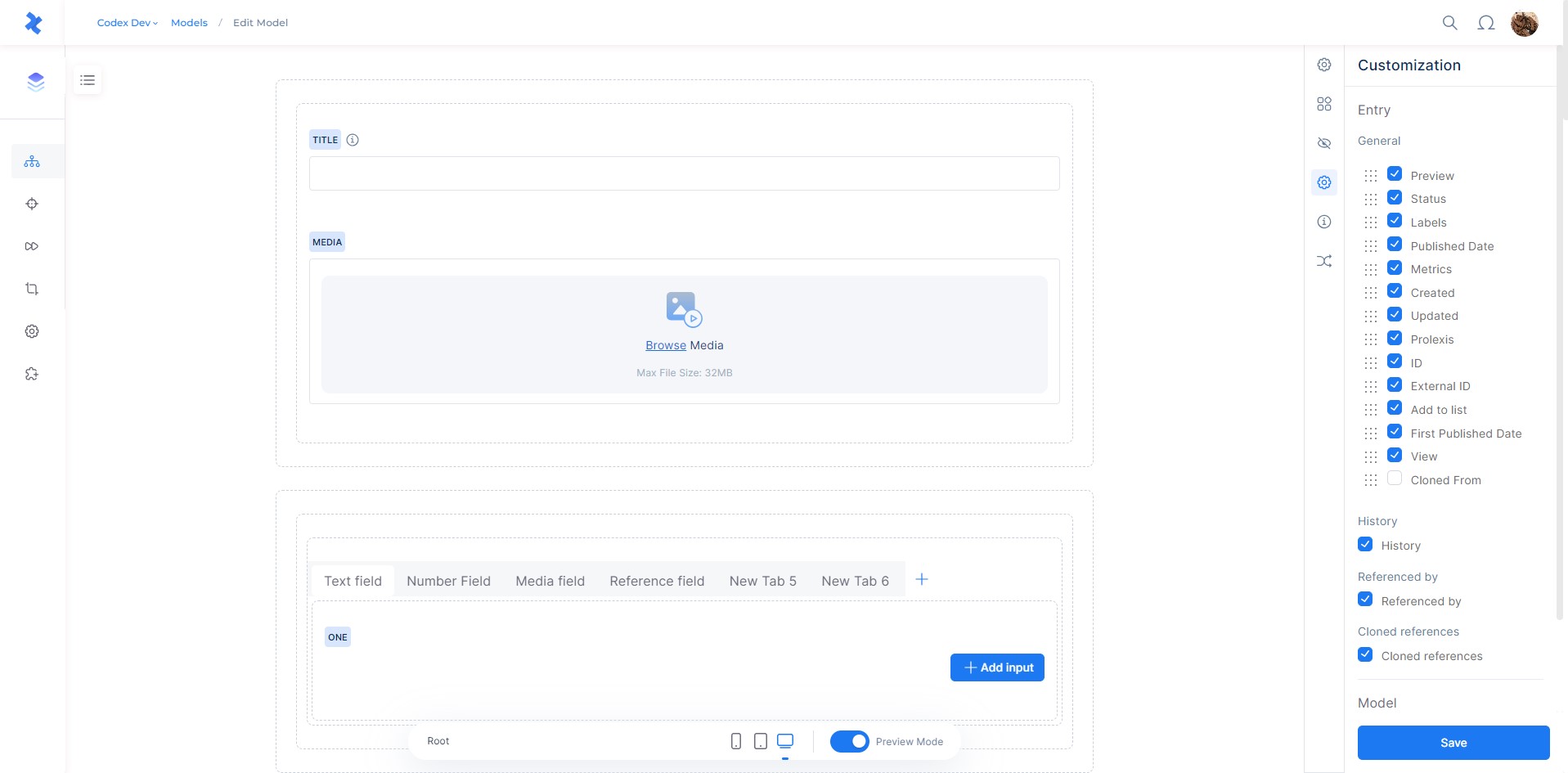
Before the entry sidebar component will render for a specific model, you must enable it in the model's settings. To do so, navigate to the model's settings in the Codex admin and select the Customization tab. Then, enable the entry sidebar component, from where you can also set the order where it will appear in the sidebar.
Creating the Vue Component
Develop your Vue component according to your plugin's functionality. The component can access several props:
entry
The current entry data
entryVersion
The current selected version data of the entry
model
The model data for the entry
setFieldValue
A function that allows updating the value of any field in the entry.
Using setFieldValue, you can programmatically update field values.
For example:
setFieldValue('date', '2000-12-11T22:00:00.000Z')sets the field with date alias to a specific value.setFieldValue('title', 'Entry title')sets the field with title alias to a specific value.setFieldValue('system.labels', [{id: 'lbynwt90jU'}, {id:'lbM0yKA7Hw'}, {id:'lbCQond1yZ'}])sets the labels system field to a specific value.
The component can access several provided functions:
publishCallback
A function that allows publishing the entry, it accepts a callback function which is called after publishing entry request is finished. The callback function is called with an argument (Boolean) which indicates if the entry is published or not.
Also check the example component.
System Field Validation
system.labels- List: Validates an array of label objects, each with:
id: Required string.
- List: Validates an array of label objects, each with:
Field Type Validations
Integer
- Single: Validates a nullable integer.
- List: Validates an array of integers.
Decimal
- Single: Validates a nullable decimal number.
- List: Validates an array of decimal numbers.
Text
- Single: Validates a string.
- List: Validates an array of strings.
Media
- Single: Validates a media object with:
id: Required string.type: Required number, one of predefined values as follows:IMAGE: 1
FILE: 2
VIDEO: 3
VIDEO_PLAYLIST: 4
AUDIO: 5
PODCAST: 6caption: Nullable string.focalPoints: Object, keys are dynamic, each having an object withxandy(numbers between 0 and 1).
- List: Validates an array of media objects as defined.
- Single: Validates a media object with:
Rich Text
- Single: Validates a string representing rich text.
JSON
- Single: Validates a JSON object.
Boolean
- Single: Validates a boolean value.
Location
- Single: Validates a location object with:
address: String.latitude: Number.longitude: Number.
- Single: Validates a location object with:
Reference
- Single: Validates a reference object with:
entryId: Required string.model: Required string.
- List: Validates an array of reference objects as defined.
- Single: Validates a reference object with:
DateTime
- Single: Validates a date-time string in ISO format.
- List: Validates an array of date-time strings in ISO format.
Rich Content
- List: Validates an array of objects representing rich content.
Author
- Single: Validates an author object with:
id: String.
- List: Validates an array of author objects as defined.
- Single: Validates an author object with:
Tag
- List: Validates an array of tag objects, each with:
alias: Required string.externalId: Nullable string.id: String.source: Required integer, one of:CODEX: 0
DANDELION: 1
GENEA: 2
CMI_FRANCE: 3tag: Required string.
- List: Validates an array of tag objects, each with:
Section
- Single: Validates a section object with:
id: Required string.isMain: Nullable boolean.
- List: Validates an array of section objects as defined.
- Single: Validates a section object with:
URL
- Single: Validates a nullable string as URL.
Example Component
Below is an example Vue component demonstrating the use of the available props:
<template>
    <!-- Your HTML structure here -->
</template>

<script>
    export default {
        name: 'ClonedFrom',
        inject: ['userCan', 'codexContext', 'publishCallback'],
        props: {
            entry: Object,
            entryVersion: Object,
            model: Object,
            setFieldValue: Function,
        },
        data() {
            return {
                // Your data properties here
            }
        },
        methods: {
            publishEntry() {
                this.publishCallback((isPublished) => {
                    // Your code
                })
            }
        }
    }
</script>

<style scoped>
    /* Your CSS here */
</style>
Conclusion
By following these steps, you can create a custom entrySidebar component for your Codex plugin. This component can provide additional functionality and contextual information within the entry interface, improving the content management experience. Remember to adhere to best practices in Vue.js development and Codex plugin structure for optimal performance and integration.